Introducing #devBnB.
-
Introducing #devBnB. Where city developers can “book” coding opportunities to go to a farm or small village project in need of open source/hardware expertise to build farm solutions, federated power grids, rural traffic solutions, reverse-engineer proprietary shit. Escape from the city. Build open source code. Feel nature. Experience small communities. It’s what you want. Admit it
")
A weird idea, but who knows, sounds like a fun project! Wanna join?
-
Introducing #devBnB. Where city developers can “book” coding opportunities to go to a farm or small village project in need of open source/hardware expertise to build farm solutions, federated power grids, rural traffic solutions, reverse-engineer proprietary shit. Escape from the city. Build open source code. Feel nature. Experience small communities. It’s what you want. Admit it
A weird idea, but who knows, sounds like a fun project! Wanna join?
Farmers and small villages can offer their opportunities, with requirements and a nice place to work in, a place to sleep with bird and nature sounds. Accompanied by some backend peers that help build the big(ger) picture. Wouldn’t that be a nice thing?
cc @EUCommission2/5
-
Farmers and small villages can offer their opportunities, with requirements and a nice place to work in, a place to sleep with bird and nature sounds. Accompanied by some backend peers that help build the big(ger) picture. Wouldn’t that be a nice thing?
cc @EUCommission2/5
Ah, why not. devBnB.eu and .org booked. Someone squatted the .com domain years ago, but I don’t care yet. Will put up a landing page tomorrow and whoever wants to (help) build it, let’s go
@EUCommission3/5
-
Ah, why not. devBnB.eu and .org booked. Someone squatted the .com domain years ago, but I don’t care yet. Will put up a landing page tomorrow and whoever wants to (help) build it, let’s go
@EUCommission3/5
Maybe I can get @nlnet @zendis @michiel and others interested? @EUCommission
4/5
-
 undefined Oblomov ha condiviso questa discussione
-
Maybe I can get @nlnet @zendis @michiel and others interested? @EUCommission
4/5
https://www.devbnb.eu
https://www.devbnb.orgThe domains are connected. They have their letsencrypt certificates. A very simple static landing page is made. I think I have deserved a morning coffee now
After that I will configure the mail stuff and write some more content on the concept. Please add your ideas too! I mirror the site code at https://codeberg.org/jwildeboer/devbnb where you can open issues to share your thoughts!5/5
-
https://www.devbnb.eu
https://www.devbnb.orgThe domains are connected. They have their letsencrypt certificates. A very simple static landing page is made. I think I have deserved a morning coffee now
After that I will configure the mail stuff and write some more content on the concept. Please add your ideas too! I mirror the site code at https://codeberg.org/jwildeboer/devbnb where you can open issues to share your thoughts!5/5
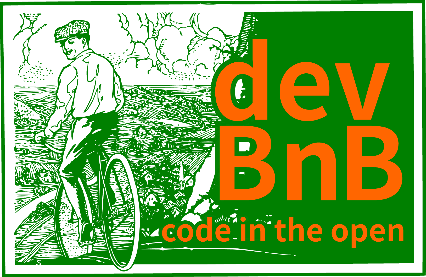
Addendum: And that's my current proposal for the logo. It's in the assets/SVG folder of the repo, also assets/PNG for bitmap versions. Steampunky, friendly, old-school and in the colours every farmer recognises
")
https://codeberg.org/jwildeboer/devbnb/src/branch/main/assets
-
Addendum: And that's my current proposal for the logo. It's in the assets/SVG folder of the repo, also assets/PNG for bitmap versions. Steampunky, friendly, old-school and in the colours every farmer recognises
https://codeberg.org/jwildeboer/devbnb/src/branch/main/assets
Some feedback received and I agree. The contrast between green and orange isn't the best. For people with colour vision impairment (especially red/green) it might be almost unreadable. So here's a variation with buttery yellow instead. which do you prefer? (vote in next reply)
-
Some feedback received and I agree. The contrast between green and orange isn't the best. For people with colour vision impairment (especially red/green) it might be almost unreadable. So here's a variation with buttery yellow instead. which do you prefer? (vote in next reply)
^^ Which logo looks nicer?
-
^^ Which logo looks nicer?
@jwildeboer the green-orange one is really bad for ppl with red-green color blindness. At least I can't distinguish the colors of the letters from the greenish background around. If that are the favourite colors you should definitely use some white margin around the letters, or something similar.
-
^^ Which logo looks nicer?
@jwildeboer the second one is illegible for me (red/green color blind)